Research | Brand | Prototype
The food truck industry has grown exponentially in the past several years, and its mobile nature presents unique needs for vendors and their customers.
Design an iOS app that allows users to search for updated locations of local food trucks, view menus and reviews, select and order food, and complete payment, all from their iPhone. Make each transaction a delightful user experience for vendors and foodies alike.
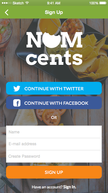
The food truck industry is filled with bold colors and playful names. This app needed to speak that language.
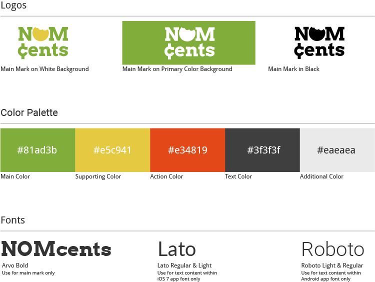
Through mind-mapping, I narrowed the name choices to three different options that spoke to the app's main goals. An informal poll of local food truck patrons landed me on Nomcents.
Finally, I selected a color scheme that brought to mind fresh, convenient, comfort food. I chose a typeface inspired by a certain well-loved, cookie-eating, puppet monster.
While Nomcents had no direct competitor, apps such as GrubHub, Zomato, and Off-the-Grid offered varied competitive opportunities and challenges. I examined the shared user stories of each app through SWOT analyses.
The analysis provided insight into best practices and helped narrow the design path. It also highlighted potential issues users could face with an app that tried to do too much.
I quickly learned that creating a map of the Nomcents app itself was an invaluable step before starting my design. By laying out a map of each screen view, I determined a clear structure for how each screen would connect. With a clearer app structure, I could focus on a preliminary set of wireframes.
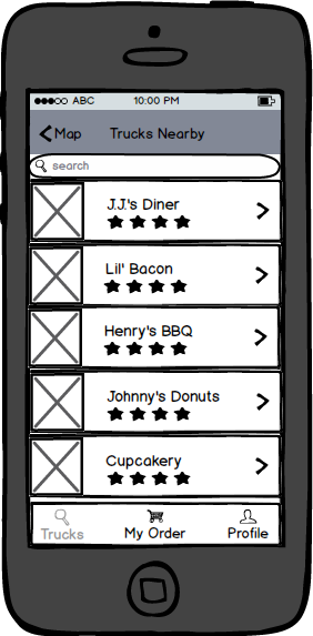
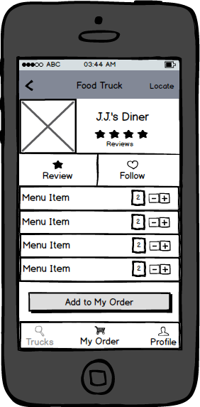
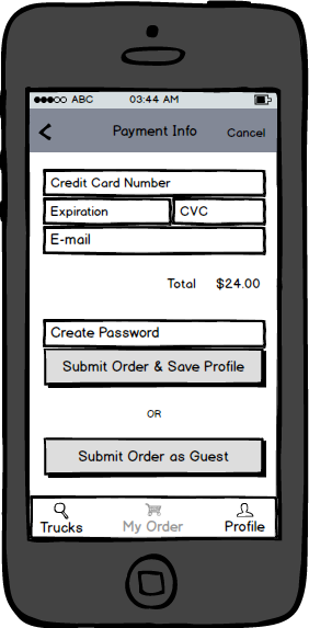
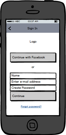
To establish placement of the UI elements on each page, I created low-fidelity wireframes. I focused on adapting the design to a very low-barrier, low-friction onboarding process for users.
An important aspect where users often drop out of an app is at sign up. Nomcents would allow users to search for and even purchase food without needing to sign up. Instead of requiring sign up before the point of sale, users would see an easy opt-in at the end of their transaction.
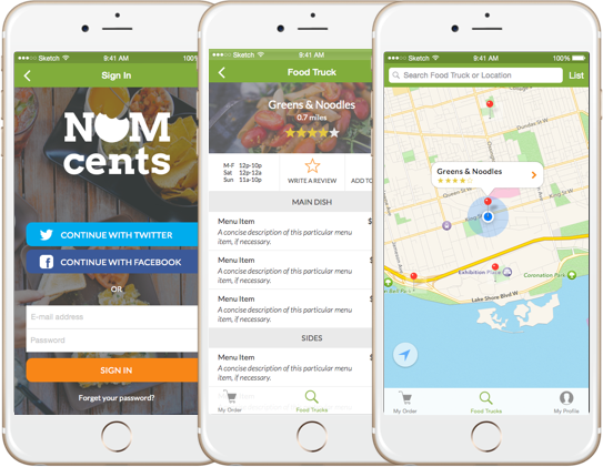
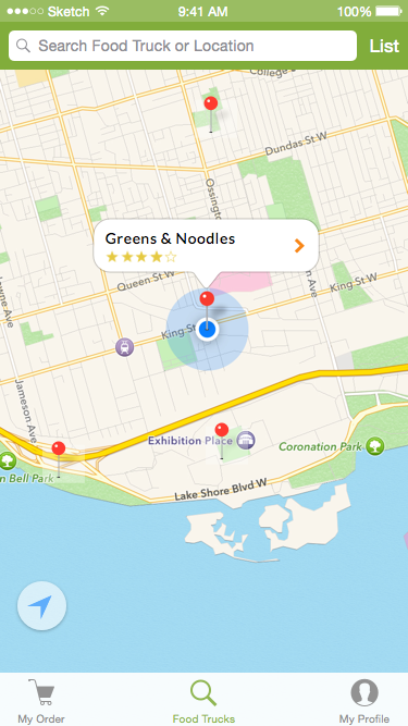
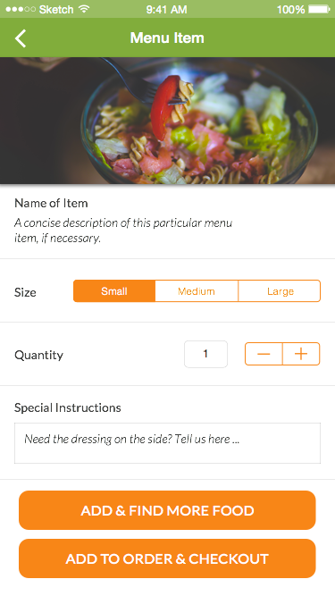
In Sketch, I drew up detailed prototyped for each screen within the Nomcents app. I focused on creating a clean, photo-centric visual design that would keep users engaged and coming back for its uncluttered and informative interface.
While it was often tempting to stray from them, I found Apples iOS design principles of Deference, Clarity, and Depth to be an excellent set of guides as I designed Nomcents. I encountered challenges and small changes that needed to be made in order to stay inside the lines, but most changes proved to truly pay off in the end.
Using InVision, Peek, and UserTesting, I sent my design through a round of tests. Users noted the clean design and moved quickly through each task without pause.
Overall, I received positive feedback. Critiques included users looking for a clearer indication that their order was complete so I added a clear confirmation screen to thank them for their order.
Another user suggested that the search screens could be improved with a "refine by food genre" ability in their search for food trucks. This would be an excellent addition in a future version.
Working with Nomcents enlightened me to what it means to design an iOS app from the very early stages through to a highly-detailed design in a single week.
App-mapping proved to be far more important with iOS design than I expected. The importance of getting that piece right from the beginning cannot be overstated when approaching the design phase.
Working through the research and design for Nomcents, I gained confidence in my own process and in the iterative process as a whole.