Research | Brand | Prototype
Design a web application that would provide photographers with a place to find volunteer opportunities for causes local to them. Using UX principles, design it with emphasis on what would be needed to attract photographers to the site and keep them coming back.
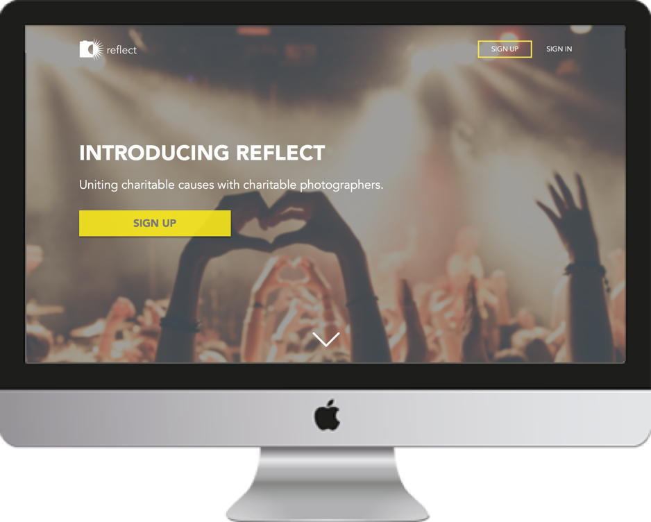
Reflect sprung up out of a need I noticed during my time as a portrait and wedding photographer. On several occasions, I was approached by charitable organizations in need of photography to raise awareness for their cause. After the first time donating my services, I was hooked and began looking for other events where I could contribute to my community.
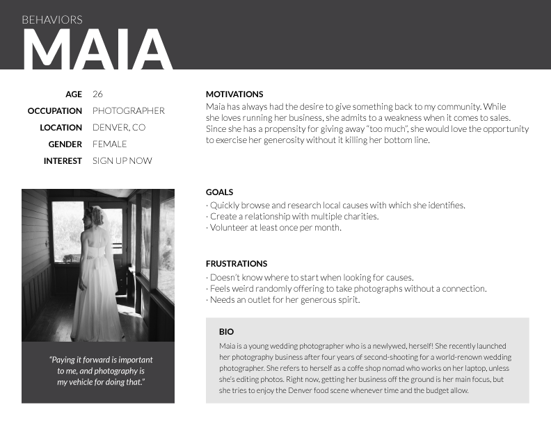
From my own previous experiences, I felt that Reflect was something that would certainly benefit charities who needed photography, but I needed to make sure photographers would be interested in participating. I conducted a survey to measure interest and to get a sense of who my primary users would be.
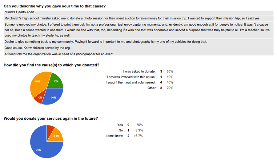
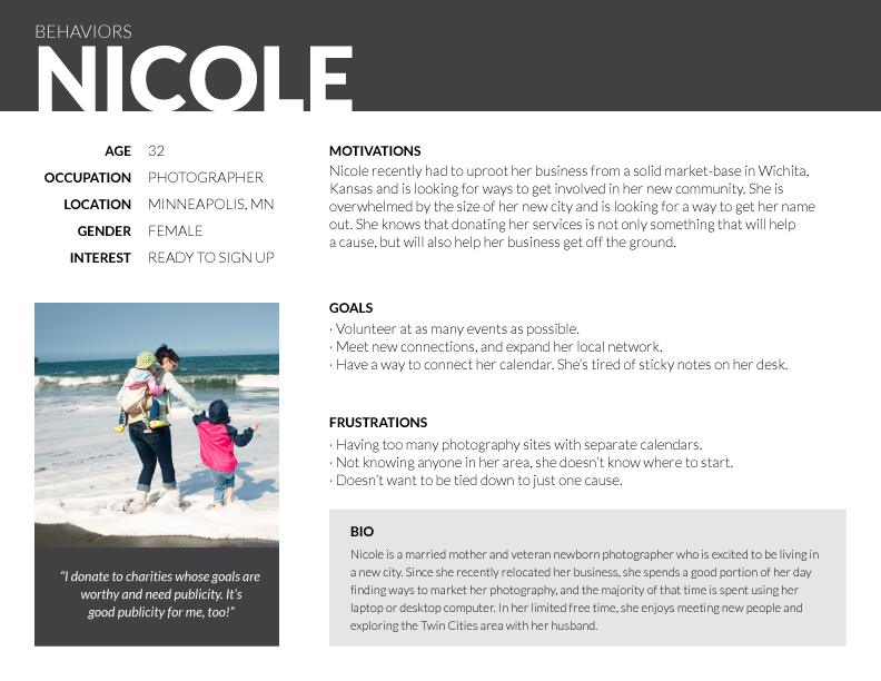
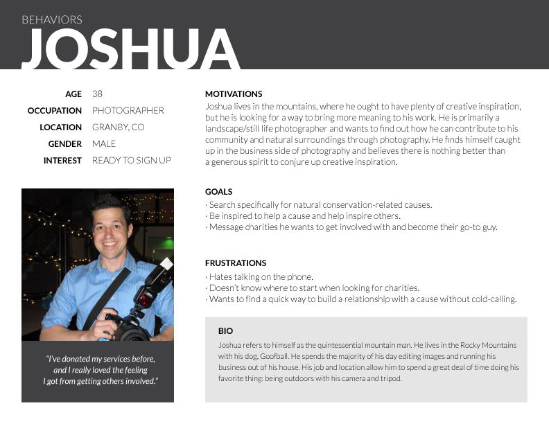
Survey results showed a clear interest from photographers, and it also gave me a pretty clear idea of my user demographics. Three personas embodied the general motivations of my primary users.
Developing a name for this project was admittedly one of the more difficult pieces of the project.
Before landing on Reflect, I went through multiple webs of mind maps and word association exercises, which helped me decide to rule out the more obvious names.
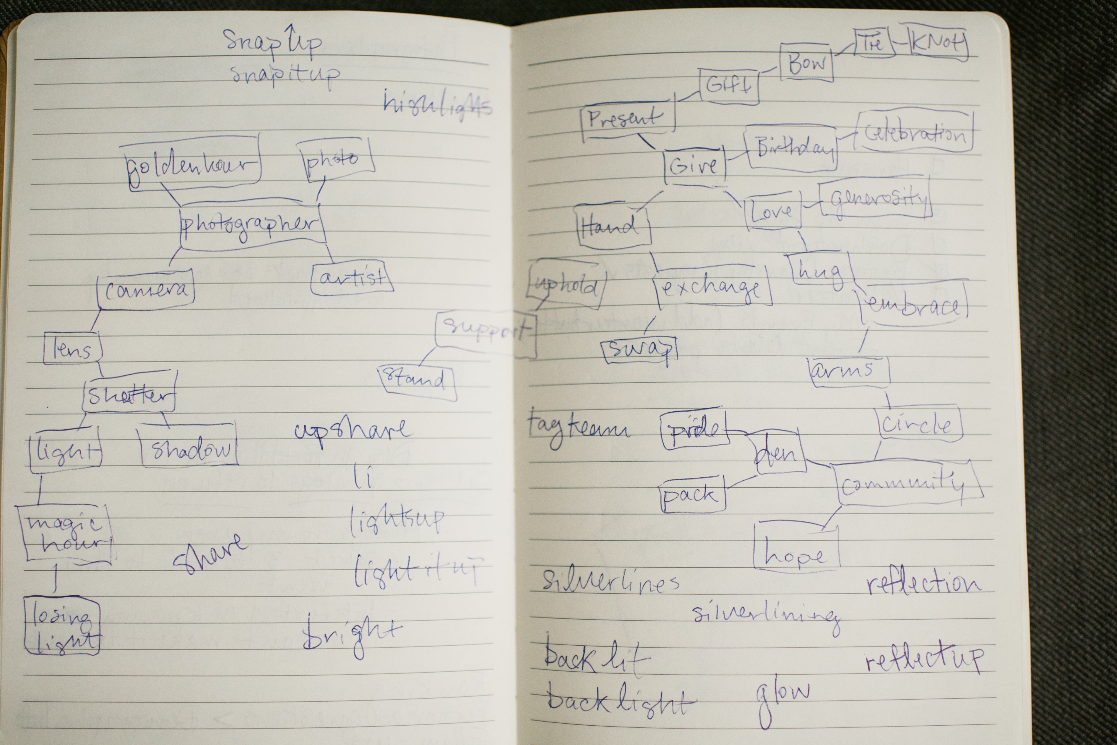
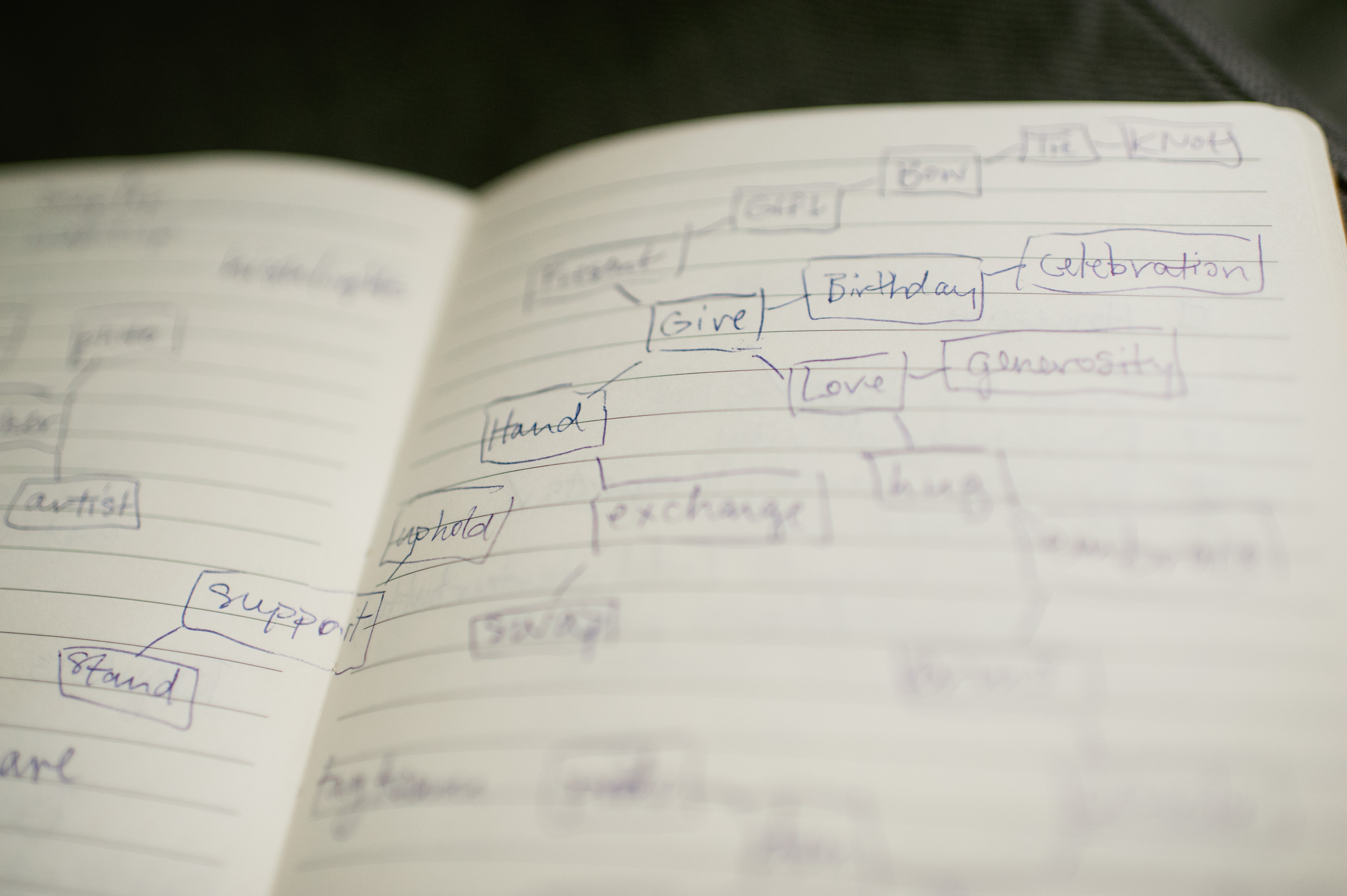
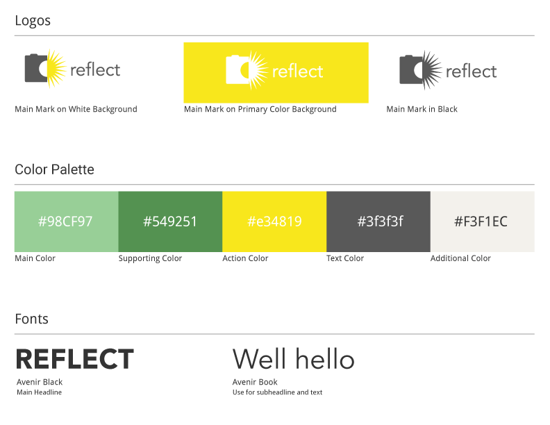
"Reflect" had a clear allusion to photography, but I ultimately chose it after a bumper sticker reminded me of Mahatma Ghandi’s charge: “Be the change you wish to see in the world.”
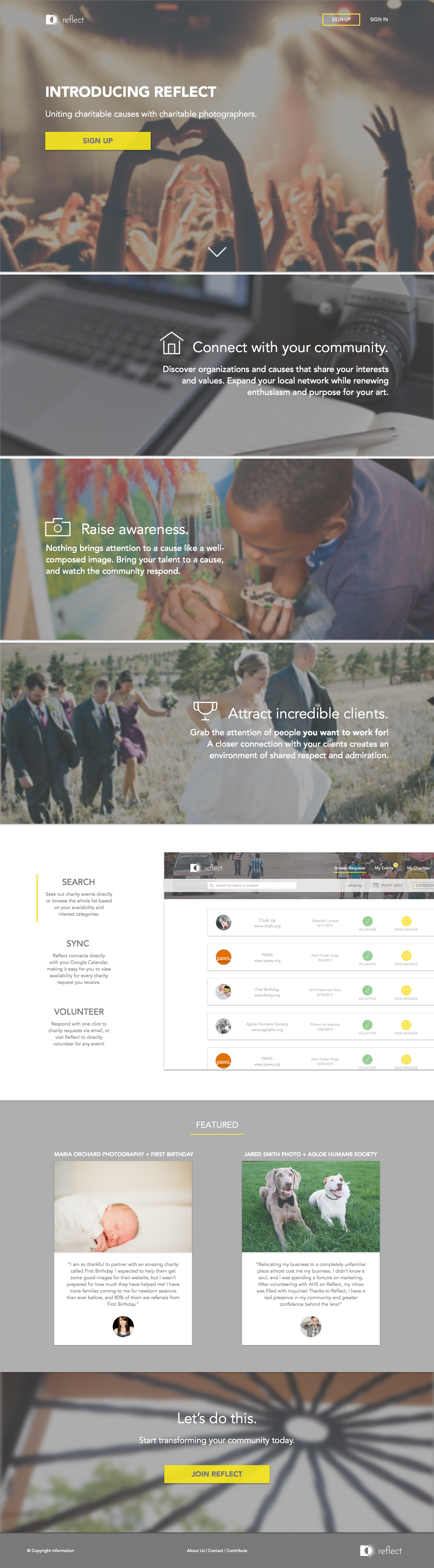
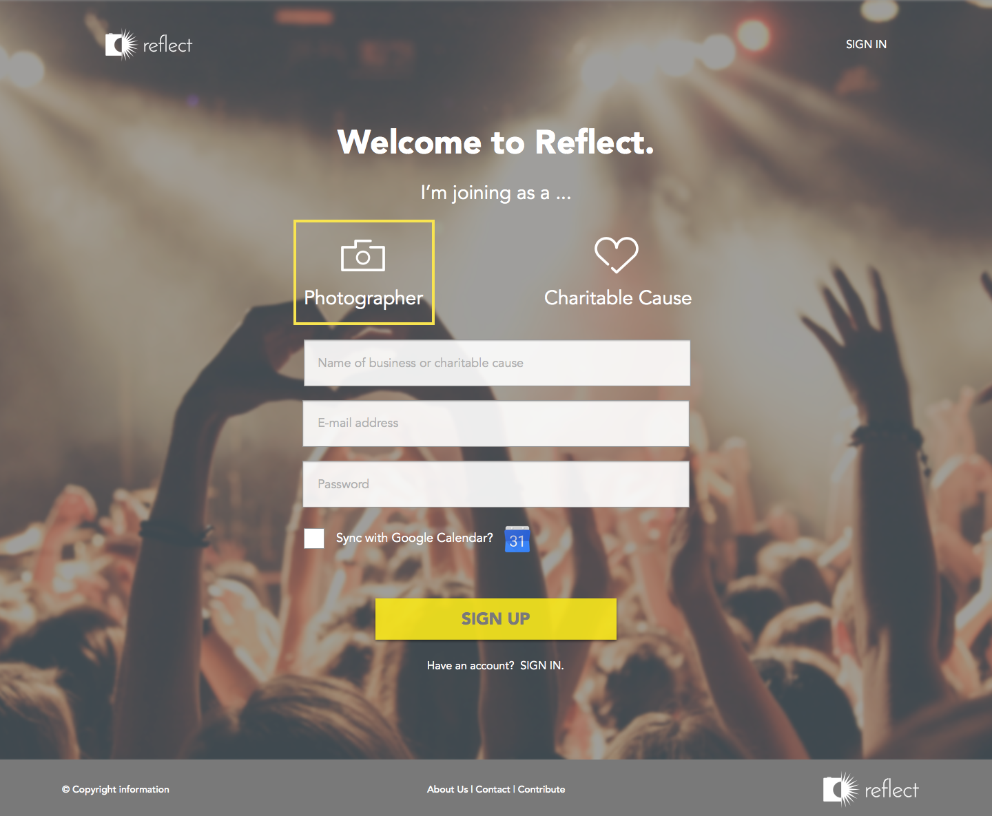
Given the somewhat abstract nature of its name, Reflect's logo called for something more direct and literal. I had a pretty clear idea from the outset and was able to accomplish a simple, flat icon using Illustrator.
A cheerful color scheme played off the sunshine in the logo and fit nicely with the theme of giving generously. I kept the scheme relatively simple with analogous colors making room for potentially colorful photographs.
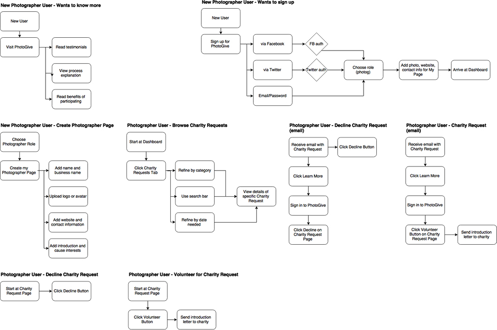
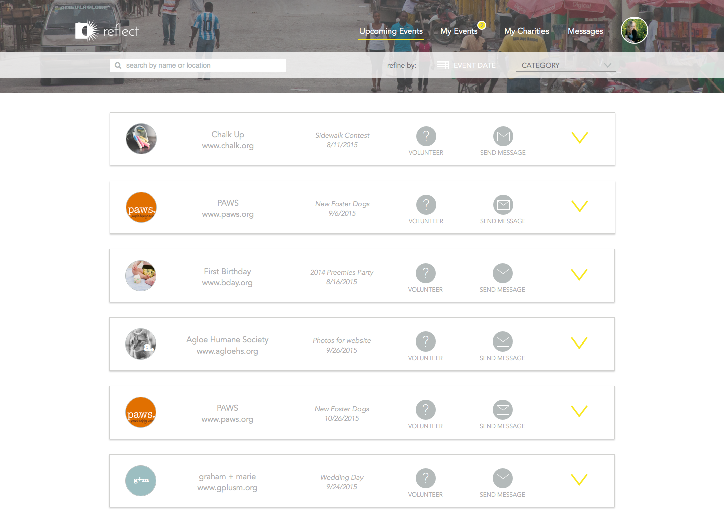
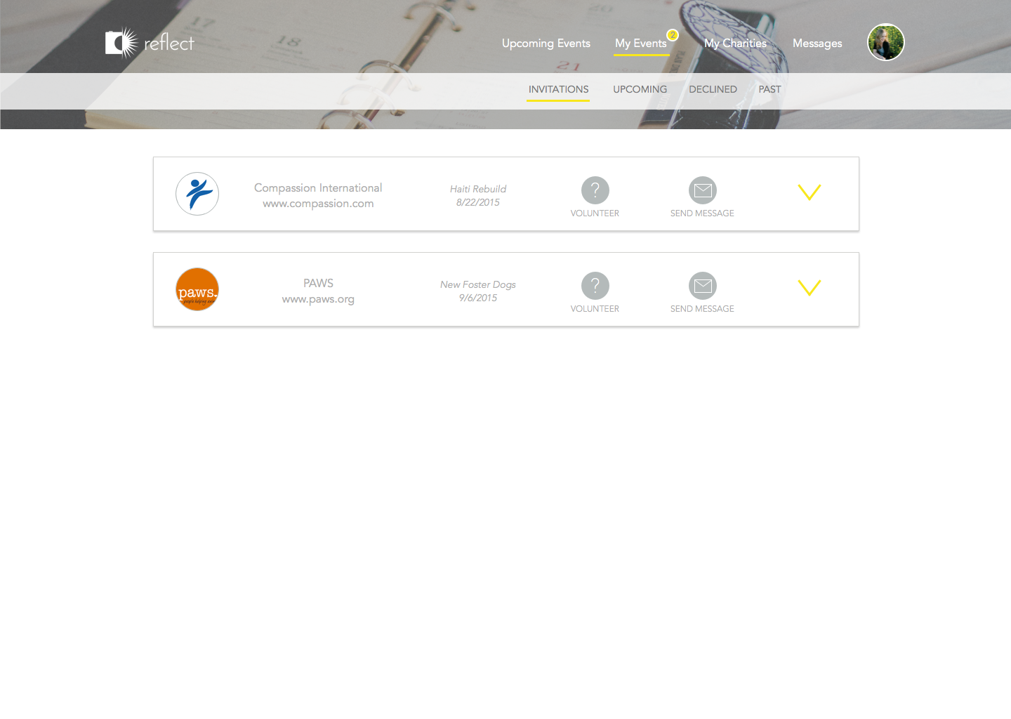
To develop a sound design, I needed to think about the various paths that any given user might take through the site. Listing them out helped me to rank the user stories and separate the crucial stories from the nice-to-have features.
I ranked and chose my most important user stories to create user flows for a photographer using Reflect.
Using Balsamiq, I created low-fidelity wireframes for my preliminary design. This helped me prioritize the elements of each page.
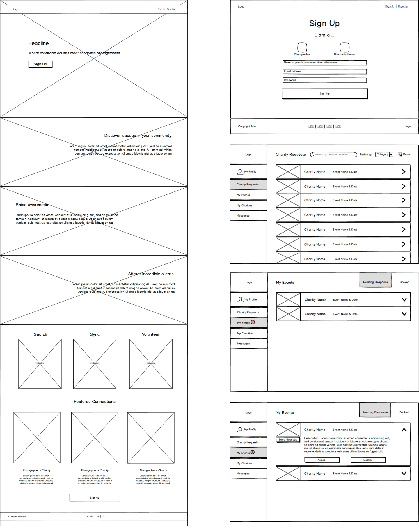
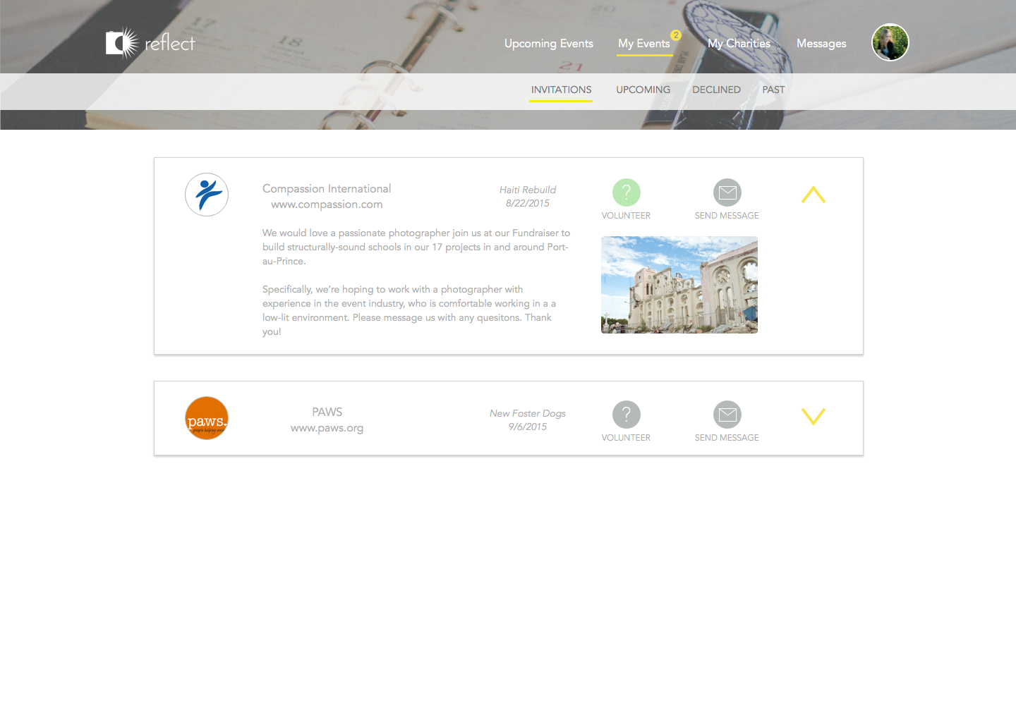
While detailing the design in Sketch, it became clear that the left-navigation in my dashboard wireframes was not allowing for clear functionality and was disrupting my goal for a clean and straightforward dashboard interface.
As part of the iterative process, I opted for a top navigation ultimately allowed for better fit and organization of UI elements on each page.

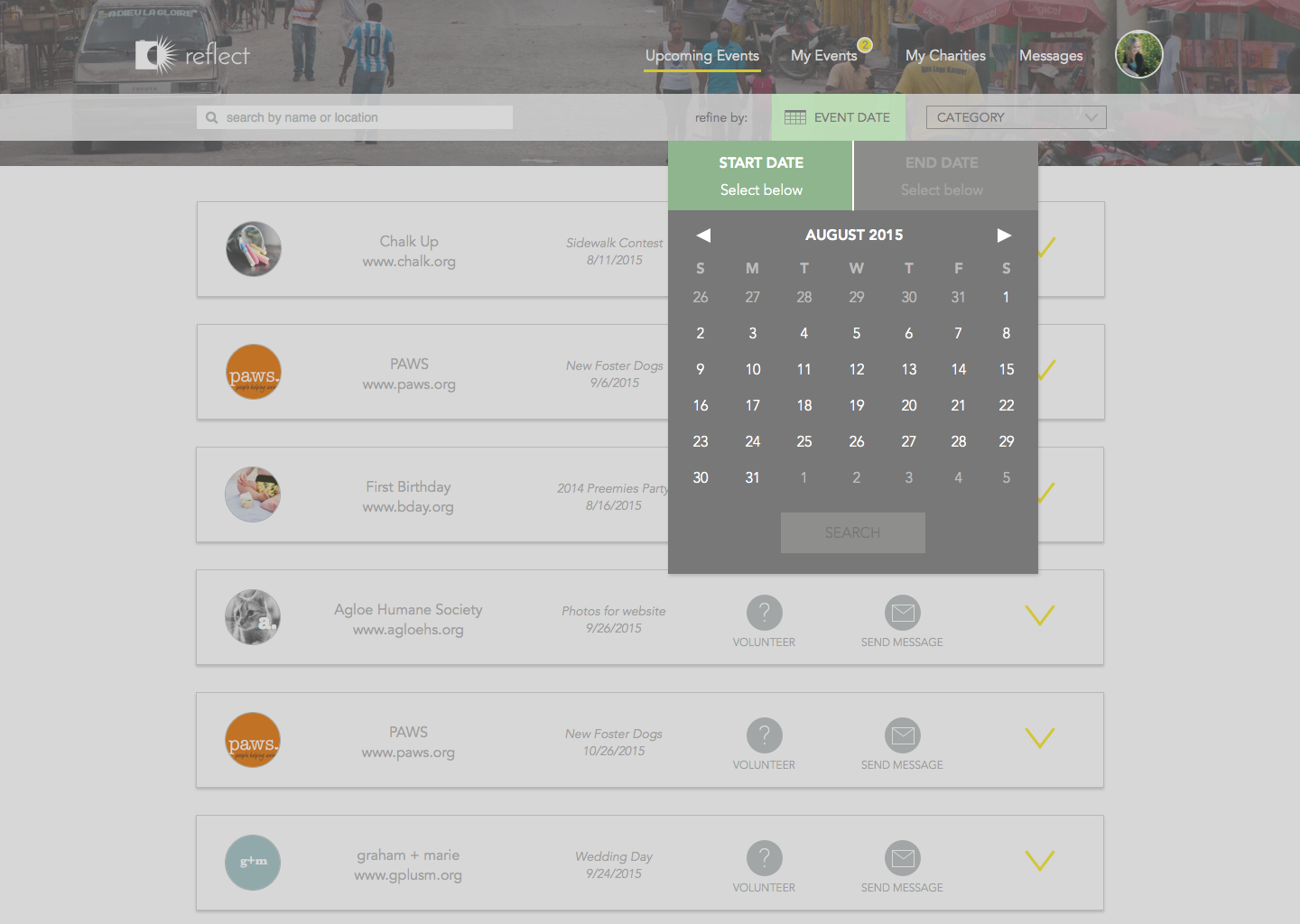
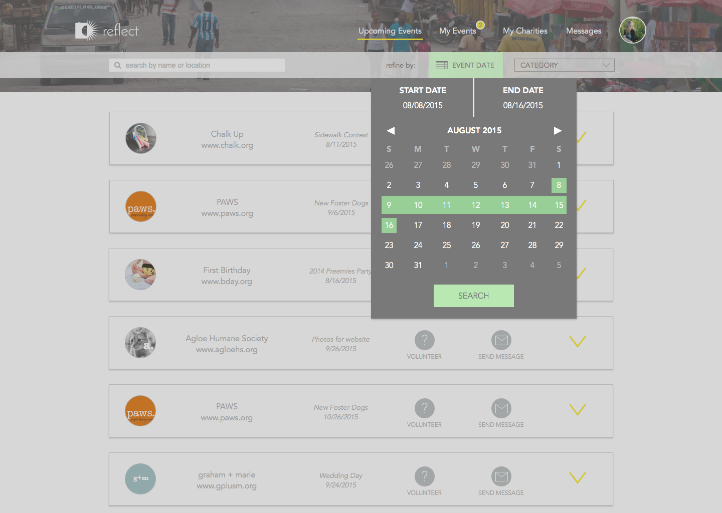
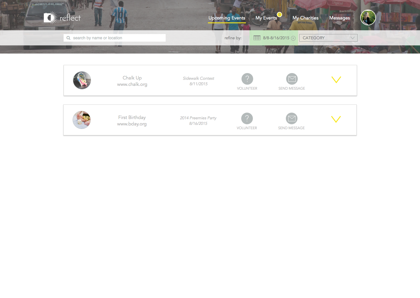
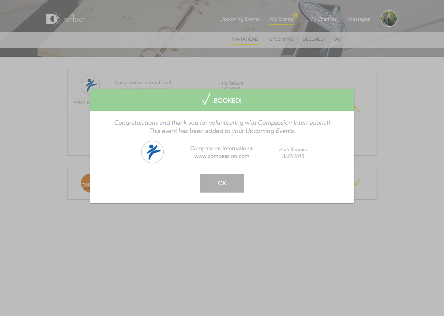
With fully detailed prototypes, I used InVision to make them interactive and wrote a formal usability test for the five user stories.
Referencing Steve Krug's usability test script, I wrote a clear script that walked each photographer through a short test of my top user stories. I conducted the test as a clickable prototype via InVision.
Feedback from users was very positive overall. A few users expressed confusion over the "upcoming events" appearing twice in two different places the navigation bar. Going forward, I'm closely examining what other changes and features would improve the upcoming versions.