Interaction Design
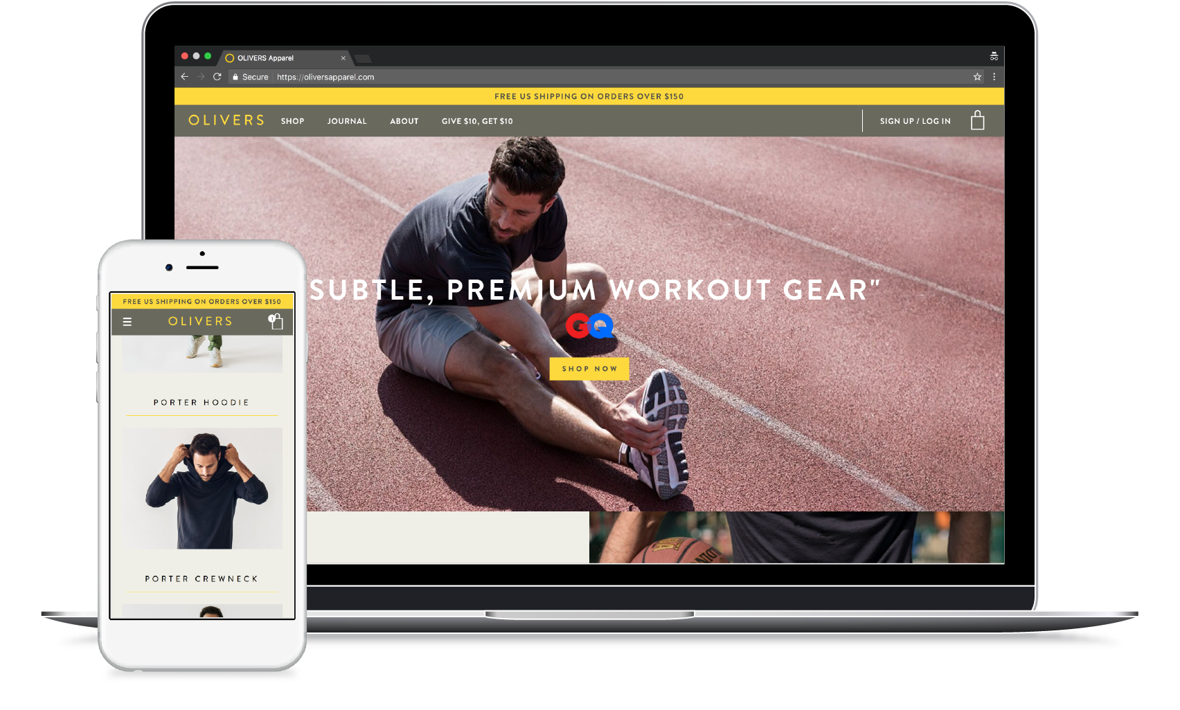
Olivers Apparel is a growing company built around providing quality performance products for men. The high-end line dedicates itself to a focused number of products with the primary focus being on offering items they know their customers will love.
Design navigation that supports Olivers' current offering of a limited product line but also sets up a system that will allow for future growth. Customers need the options to quickly find their favorite item or leisurely browse the full line. The solution must address the following two user stories:
As a user, I want to find a page of all products so I can browse the full Olivers line.
As a user, I want to find a specific product so I can purchase it quickly.
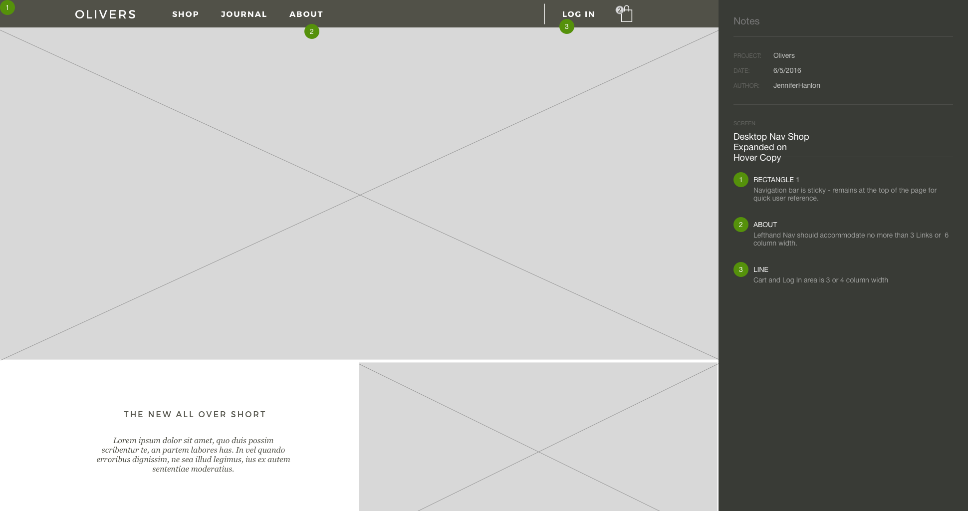
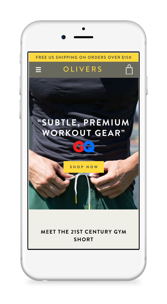
The visual design of the site was already polished and in place, but the navigation was confusing. There was no way for a user to get to a specific product without first clicking SHOP and browsing through the full product line.
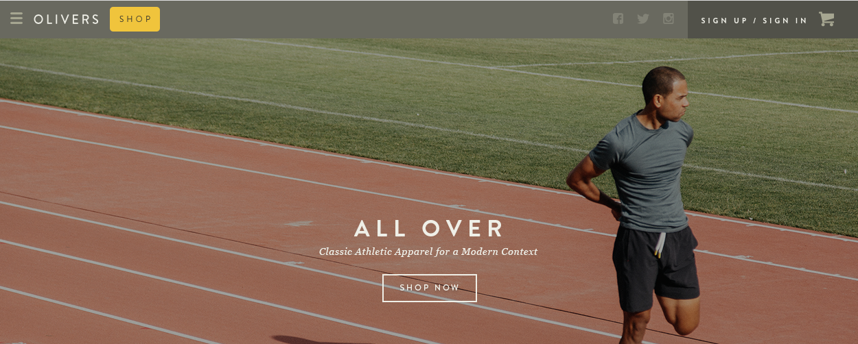
Given the limited items, I understood the original decision to go this route - there was not a clear way to group the products into separate pages. However, it was ready for some solid improvement
I thought of other brands that might face similar challenges and examined sites like Herschel Supply, Everlane, and True and Co. There was no clear one-size-fits-all navigation system, but the exploration kicked off some ideas of how to proceed.
With the visual design already in place, I opted to put together a quick set of grayscale wireframes in order to quickly communicate a set of options.
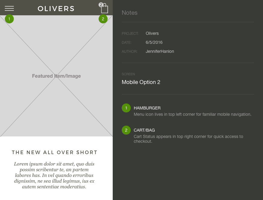
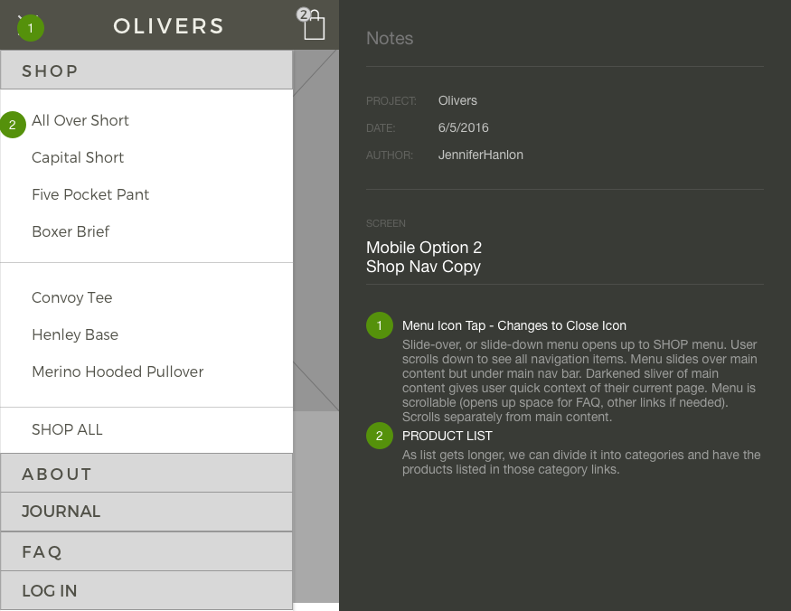
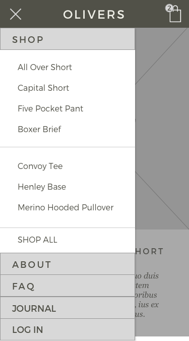
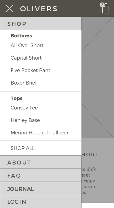
For mobile, I wanted to explore the pros and cons of the increasingly familiar hamburger menu as well as an alternative, with clearly denoted navigation links.
Ultimately, I felt the hamburger icon allowed for more shopping-focused space in the mobile viewport, without the distraction of other menu items.
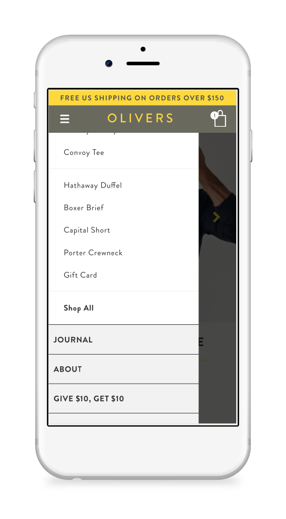
The previous mobile design had a small dropdown menu with very small touch targets. I opted for a full slider menu that would cover the full body content and give the user more space to view and select their destination.
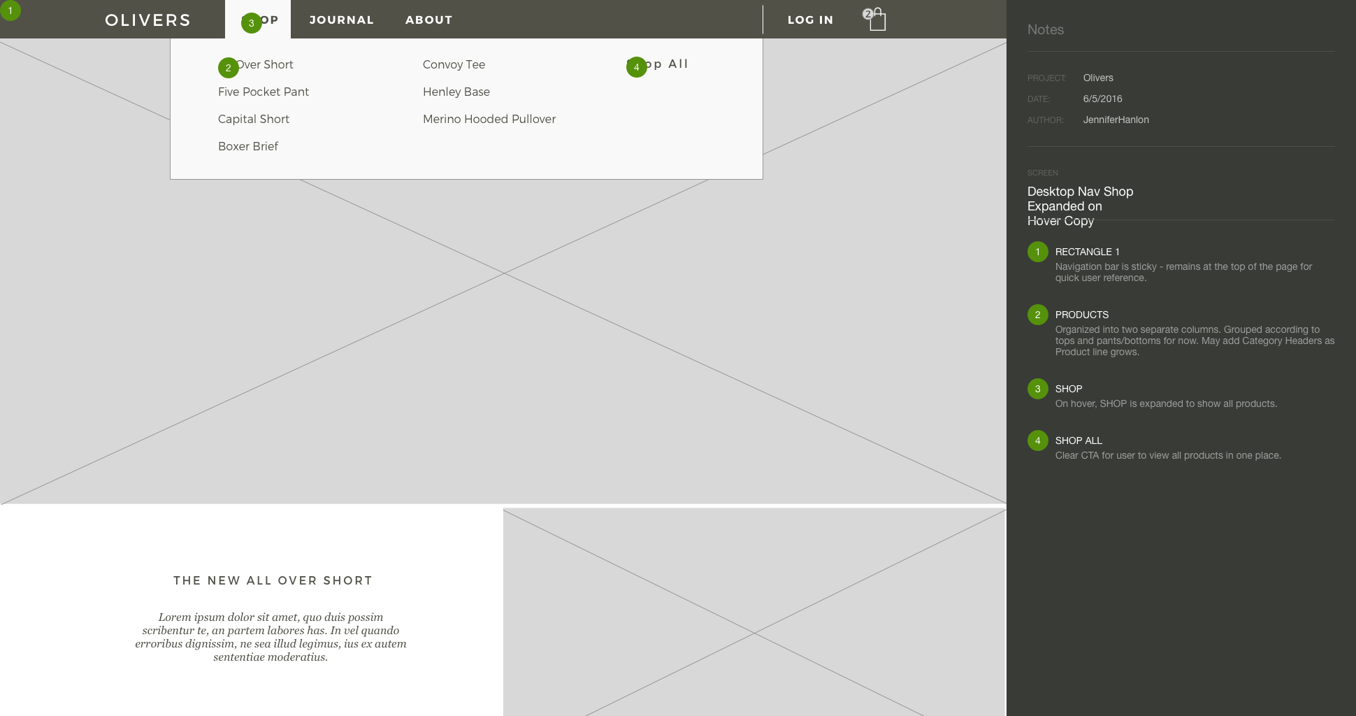
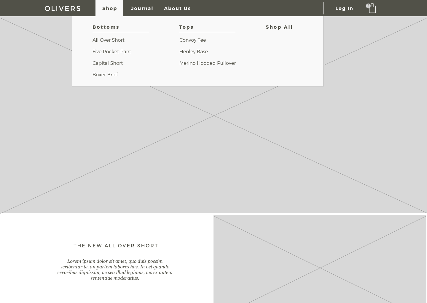
I opted to display an individual link to each product as well as a Shop All link. Having these two options clearly available catered effectively to each of my user stories. It tested as a familiar and clear approach in a time test of 30 users on Usability Hub.
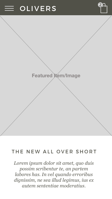
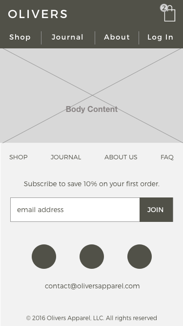
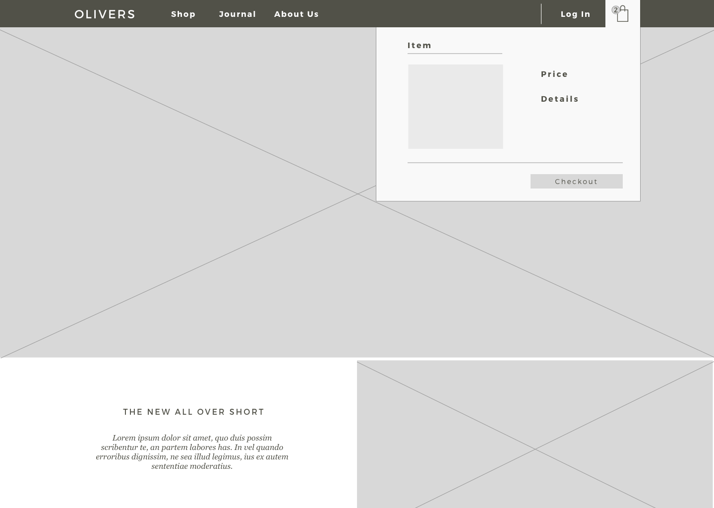
Having started by exploring the challenges of mobile design, the path forward became clear for the desktop. For continuity, I also included a new solution for a hoverstate on the desktop cart navigation. Previously, a user needed to click to see the items in their cart, and then click again to checkout.
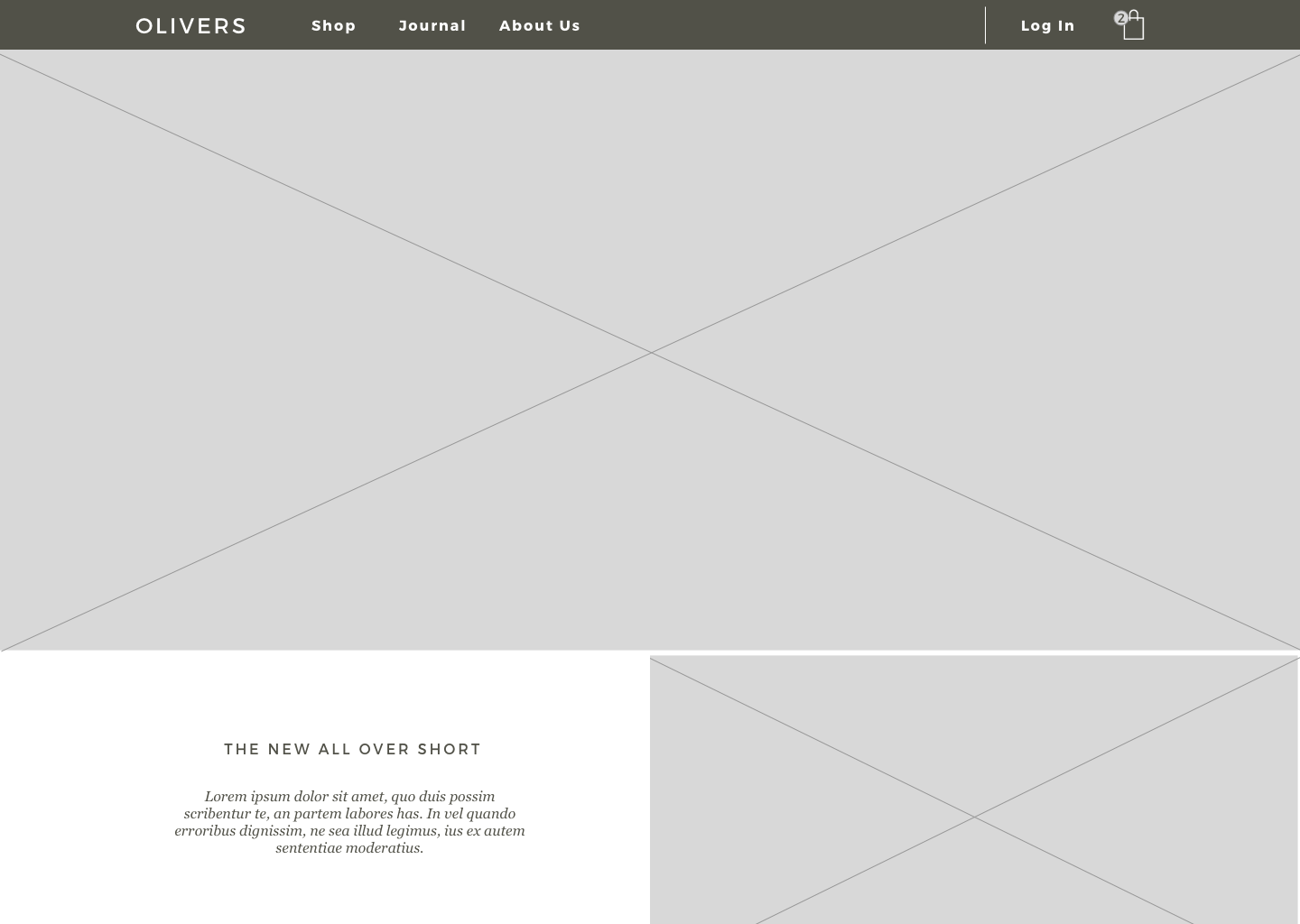
After presenting the navigation update to our client, they inquired about perhaps centering the navigation in the topbar. I explained to them the benefits of having a left-justified main navigation area, including observed patterns of eye movement, and the ability to add more menu items in the future without having to accommodate visual imbalance.
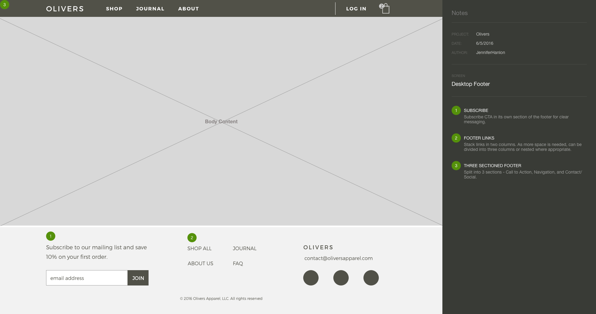
The client agreed, and I delivered the following design.